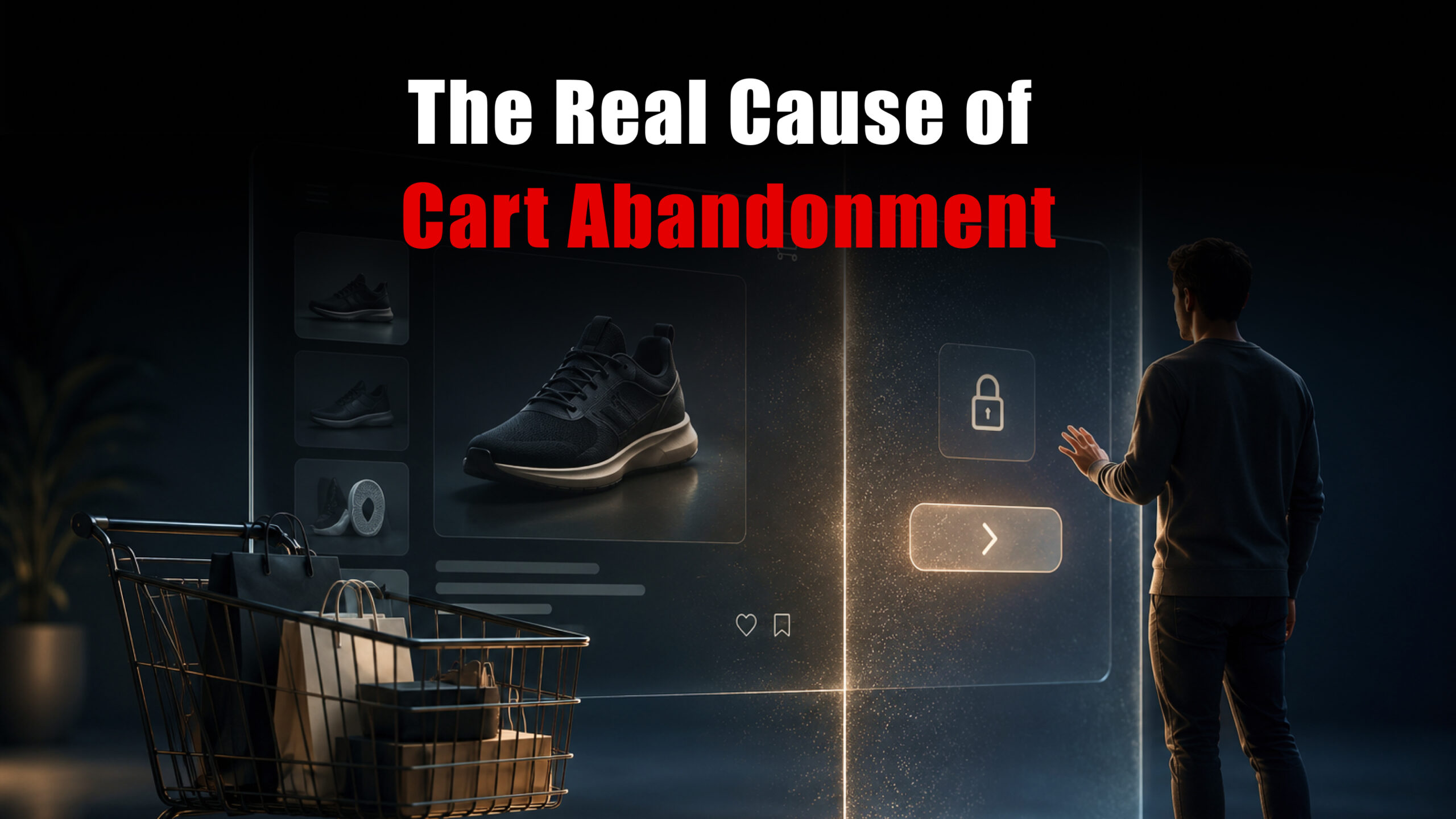
Every e-commerce store owner has stared at the same painful metric: a cart abandonment rate sitting somewhere between 65% and 80%. The gut reaction is always the same: the lower the price, run a discount, offer free shipping. But what if we told you that for most shoppers, the price was never really the problem?
After working with hundreds of eCommerce businesses, ranging from growing Shopify stores to enterprise-level Magento platforms,rms the team at eLeoRex has seen the same story play out over and over. Shoppers leave not because your product is too expensive. They leave because something in the experience broke their trust, their patience, or their momentum.
Let’s talk about what’s really happening.
The Friction Nobody Talks About
Imagine walking into a store, picking up a product, heading to the cashier,hier and then being asked to fill out a four-page form before you’re allowed to pay.
That’s what millions of online shoppers experience every single day.
The real culprits behind cart abandonment are almost always rooted in UX friction and trust gaps, not price sensitivity. Here’s what the data and our own project experience consist of.
1. Forced Account Creation
This is the single biggest conversion killer in eCommerce, yet it’s still everywhere.
A user has found what they want. They’re ready to buy. And then a wall appears: “Create an account to continue.”
At that moment, the mental calculus shifts. Instead of completing a purchase, the shopper is now weighing whether they want yet another account, another password, another inbox full of promotional emails. Most decide they don’t.
The fix: Always offer guest checkout. Make account creation optional and position it after purchase, not before. A simple “Save your details for next time?” prompt post-checkout converts far better than a mandatory registration gate.
2. A Checkout Process That Feels Like an Obstacle Course
Every additional step in your checkout is an opportunity to lose a customer. Most stores don’t realise their checkout flow has five, six, or even seven distinct screens before a purchase is confirmed.
Unnecessary fields (fax numbers in 2026?), confusing form layouts, unclear progress indicators, and pages that reload slowly on mobile, these micro-frustrations compound. The shopper was willing to buy. The checkout process talked them out of it.
The fix: Audit your checkout flow for every nonessential field. A well-optimised checkout should be complete in two to three steps. Progress indicators, autofill support, and mobile-first form design aren’t extras; they’re the baseline.
3. Surprise Costs at the Final Step
This one does involve money,y but not in the way most people think.
It’s not that the shipping cost is too high. It’s that the shopper didn’t see it coming. Discovering a ₹499 shipping fee or unexpected tax on the final screen feels like a bait-and-switch, and it triggers the same emotional response as being deceived.
The fix: Surface all costs as early as possible. Show estimated shipping on the product page or, at a minimum, in the cart view. Transparency at the top of the funnel protects conversions at the bottom.
4. A Website That Doesn’t Feel Safe
Trust is invisible until it’s missing. Shoppers make subconscious security assessments throughout their session, and a site that feels dated, slow, or visually inconsistent fails those assessments silently.
An expired SSL certificate, a design that looks like it hasn’t been updated since 2015, no visible return policy, or a checkout page that suddenly redirects to a different domain any of these can cause an otherwise willing buyer to close the tab.
The fix: Invest in trust signals: updated design, visible security badges, clear return and refund policies, and customer reviews near the point of purchase. These aren’t cosmetic upgrades, as they’re conversion infrastructure.
5. The Mobile Experience Was an Afterthought
More than 70% of e-commerce traffic now comes from mobile devices. Yet most stores were designed desktop-first and mobile-adapted as a secondary concern.
Tiny tap targets, text that requires zooming, images that load slowly on cellular connections, and payment flows that break on smaller screens. These issues don’t just frustrate users. They communicate that the brand doesn’t really care about the experience they’re having.
The fix: Mobile experience should be the primary design consideration, not a responsive afterthought. This means native-feeling interactions, thumb-friendly layouts, and performance optimisation for real-world network conditions.
The Underlying Pattern
Look at every reason above, and you’ll notice the same theme: the store prioritised its own convenience over the customer’s experience.
Forced accounts are convenient for CRM data collection. Long forms feel thorough to the business owner. Hidden fees make margins look cleaner on product pages. None of these decisions serves the person trying to give you money.
Cart abandonment is, at its core, a signal. It’s your customers telling you that something in the experience failed them before they could complete the transaction.
What eLeoRex Does About It
At eLeoRex Technologies, our eCommerce development practice across Shopify, WooCommerce, Magento, and custom platforms is built around one principle: the checkout experience should be the easiest part of the customer’s journey, not the hardest.
We conduct UX audits that map exactly where users are dropping off, identify the friction points in your current flow, and rebuild checkout experiences around how real shoppers actually behave. From single-page checkouts to progressive disclosure forms, from trust signal placement to mobile-first cart design, we’ve helped stores turn their biggest drop-off point into their strongest conversion moment.
If your cart abandonment rate is telling you something, it’s worth listening to.
Ready to turn abandoned carts into completed orders? Talk to the eLeoRex eCommerce team →
eLeoRex Technologies is a full-service web development and digital strategy company helping businesses build smarter, faster, and more trusted digital experiences. Explore our eCommerce services or get in touch to start a conversation.