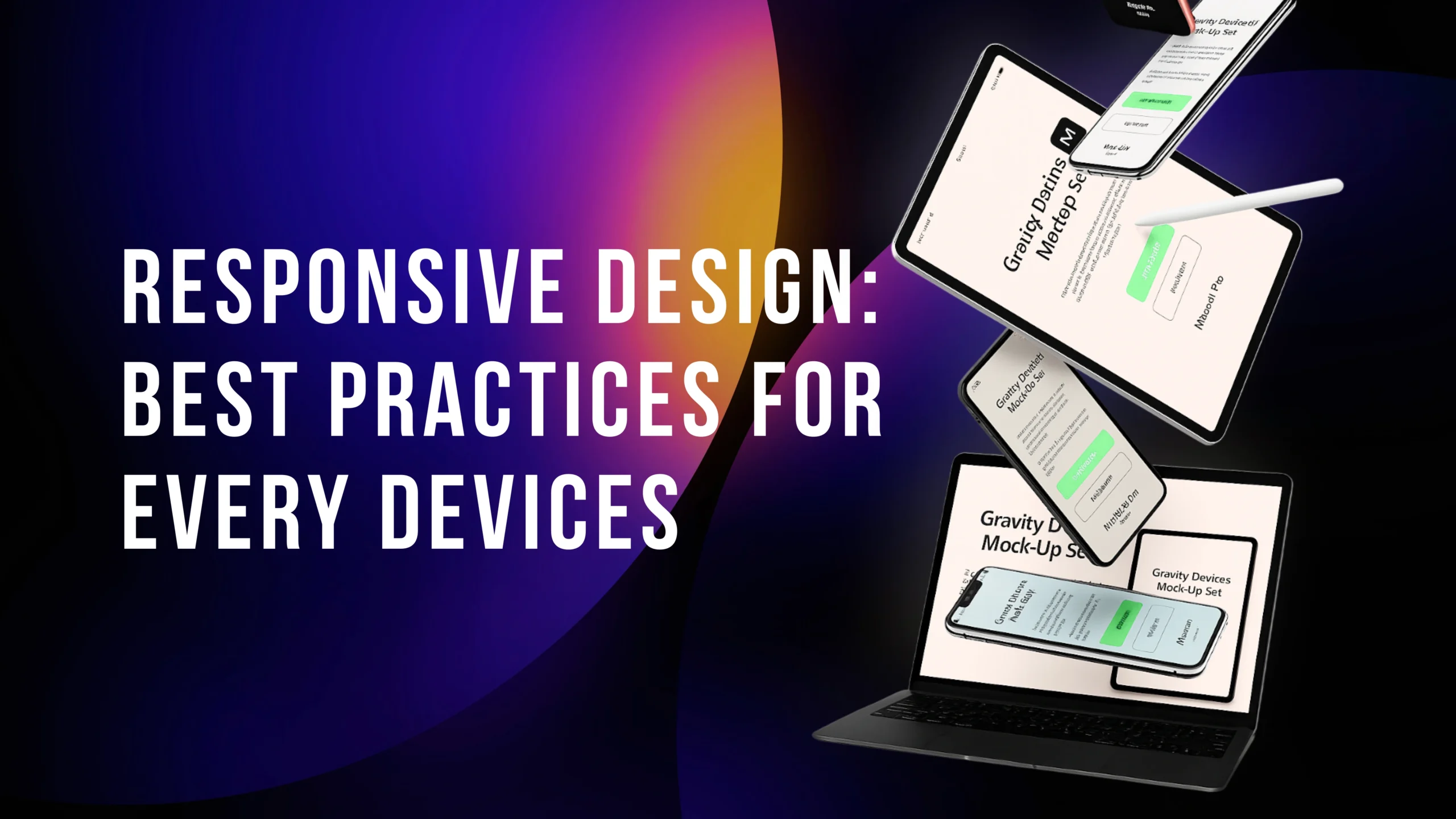
The consumption of digital goods has undergone drastic changes. No longer are websites built with desktops at the forefront of design. Fast forward to today, when users want an experience on desktops, laptops, tablets, and mobile and have no patience with a site that reacts in clunky or unresponsive ways. That’s why responsive design is not a nice-to-have, but rather a must-have for creating a great user experience (UX) on any device.
Adaptive design is focused on flexibility. It allows your website to automatically adapt its structure, content, and features when accessed on a mobile device. It means the experience remains natural whether you’re reading on a 27-inch monitor or a 5-inch smartphone.
At eLeoRex Technologies, we are committed to helping businesses develop digital solutions with users in mind by integrating responsive designs with performance-focused strategies that drive revenue growth. In this article, we’ll look at some of the best practices to help you design a website that is not only visually appealing but also helpful in serving its purpose, regardless of device type.
Why Responsive Design Matters
Modern users are impatient. Studies have demonstrated that few people stick with a page that does not load or display correctly, even after a few seconds of its loading process. Furthermore, since Google now prioritizes mobile-friendly sites in its search engine rankings, responsive design is not only about user experience but also about SEO and increased visibility.
Responsive design benefits include:
Improved accessibility across all devices.
Enhanced engagement as your users continue to view more of your content.
Increased conversions: Easier checkouts, sign-ups, or inquiries from smoother navigation.
Future-proofing, so your site works on new devices and screen types.
In other words, it’s not all about looks, it’s good for business.
Best Practices for Responsive Design
1. Mobile-First Approach
Begin by designing for the smallest screen and then scale up. This means that important content and features are now optimized for mobile users, who are also the majority of web traffic.
2. Flexible Layouts
Utilize adjustable grids that allow elements within to resize proportionally. This ensures a design looks perfect on the same ratio screens across different devices without requiring manual adjustments.
3. Scalable Images and Media
Nothing hinders a website’s performance quite like oversized image files. Either use a responsive image tag with srcset or serve the correct size via CSS depending on the device. This enhances both speed and visual quality.
4. Touch-Friendly Interactions
Mobile users swipe, not click with a cursor. Buttons need to be large enough to tap easily, menus should open out naturally, and interactive items shouldn’t be positioned too close together.
5. Prioritize Performance
It’s not for nothing that there’s NOTHING “responsive” on our new design – it’s all to do with speed, and even cached up, the shitty WP(In) admin profiles only go so far before pushing slow dogshit down the carbon tubes (that is also using a fictional delay to write out this text;) ) Code optimization, file compression, caching techniques to minimize load times. A lightning-fast site keeps users interested and content.
6. Consistent Typography
Readable text is critical. Use relative units (em or rem) for fonts, and ensure that line height scales correctly on mobile devices. Legible typography aids reading and decreases bounce rates.
7. Test Across Devices
Do not simply assume your design is applicable everywhere and test it. Tools like BrowserStack or Google’s Mobile-Friendly Test help you identify discrepancies and ensure your design is as responsive as possible.
Common Mistakes to Avoid
Responsive design can be rugged, even if you do everything right as a business. Some common pitfalls include:
- Overloading content on small screens. Minimalism works better on mobile.
- Except for landscape positioning on tablets and mobiles.
- Except for the old browsers that some of your audience may still be using.
- Never mind things like accessibility (contrast ratios and screen reader support.
By avoiding these oversights, you’re not only making your design responsive you’re also making it genuinely user-friendly.
Improve the User Experience with eLeoRex Technologies’ Responsive Design.
At eLeoRex Technologies, we know a responsive design isn’t just about fitting your content into any screen; instead, it’s about providing a seamless and appealing user experience across all devices. Our team of designers and developers leverages UI/UX research, real-world usability testing, and performance optimization to ensure your website delivers the experience your users trust, regardless of the device they use.
We have linked responsive design to your projects, whether they involve custom web development or large-scale digital strategy. The result? Beautiful websites that efficiently convert leads, build trust in your brand, and gracefully push forward with the evolution of ‘digital’.
Conclusion
Responsive design is no longer a requirement, but an option, for businesses. Utilizing best practices such as mobile-first design, scalable media, and touch-friendly navigation, along with thorough testing, enables companies to create user experiences that delight customers on every screen. By avoiding these typical mistakes, you will keep your website speedy, usable, and attractive to users.
Working with professionals like those at eLeoRex Technologies ensures that you won’t just have a responsive design with minimal impact on your technical SEO, but also one that is strategically crafted around the growth goals of your site. A good user experience is more than design in the digital world today.


