What makes you stay or leave within seconds when you visit a website? In addition to content and navigation, two more subtle yet critical design components are at work: color psychology and typography.
There is more to the colors and fonts on your digital devices than making something more visually pleasing. They have a controlling influence over feelings and perceptions, which in turn lead to user behavior. These design principles are crucial for businesses seeking to establish trust and drive conversions.
At eLeoRex Technologies, we know only too well the power of color and typography when it comes to design that considers user experience. Let’s break down these elements and learn how you can leverage them.
Why You Think About Color More Often Than You Realize
Colors serve more than just a decorative function; they can have an impact on human psychology. In fact, scientifically speaking, people make a subconscious judgment about a product within 90 seconds of initial viewing, and between 62% and 90% of that assessment is based solely on color.
Here’s how body colors can change perception:
- Blue: Trust, reliability, and tranquility (often used in finance and tech).
- Red: Indicates excitement, urgency, and passion (commonly used in sales or food brands).
- Green: Growth, balance, wellness (ideal for wellness and eco-friendly industries).
- Yellow: Represents optimism, friendliness, and warmth (good for casual and playful brands).
- Black: The color of elegance, class, and authority (widely used by high-end fashion and lifestyle brands).
Used strategically, colors can influence users’ emotions and nudge them to action whether that’s clicking a “Buy Now” button, trusting in your brand, or simply spending more time with your content.
Typography: The Silent Storyteller
It’s easy to overlook typography since it often appears more subtle than color, but typography establishes your brand’s voice from a user perspective. Fonts contribute to readability, mood, and brand character.
For instance:
- Serif fonts (e.g., Times New Roman) convey tradition, authority, and trustworthiness.
- Sans-serif fonts (such as Helvetica) are modern, clean, and approachable.
- Handwritten fonts (such as Brush Script) embody classiness, creativity, and a sentimental feel.
- Display typefaces are attention grabbers and should be used primarily for emphasis.
Typography also affects usability. Bad font choices, whether too small, overly ornamental, or inconsistent, will frustrate users and drive them away. Clean and consistent typography, on the other hand, enhances readability, builds trust with users, and gives your digital presence a professional appearance.
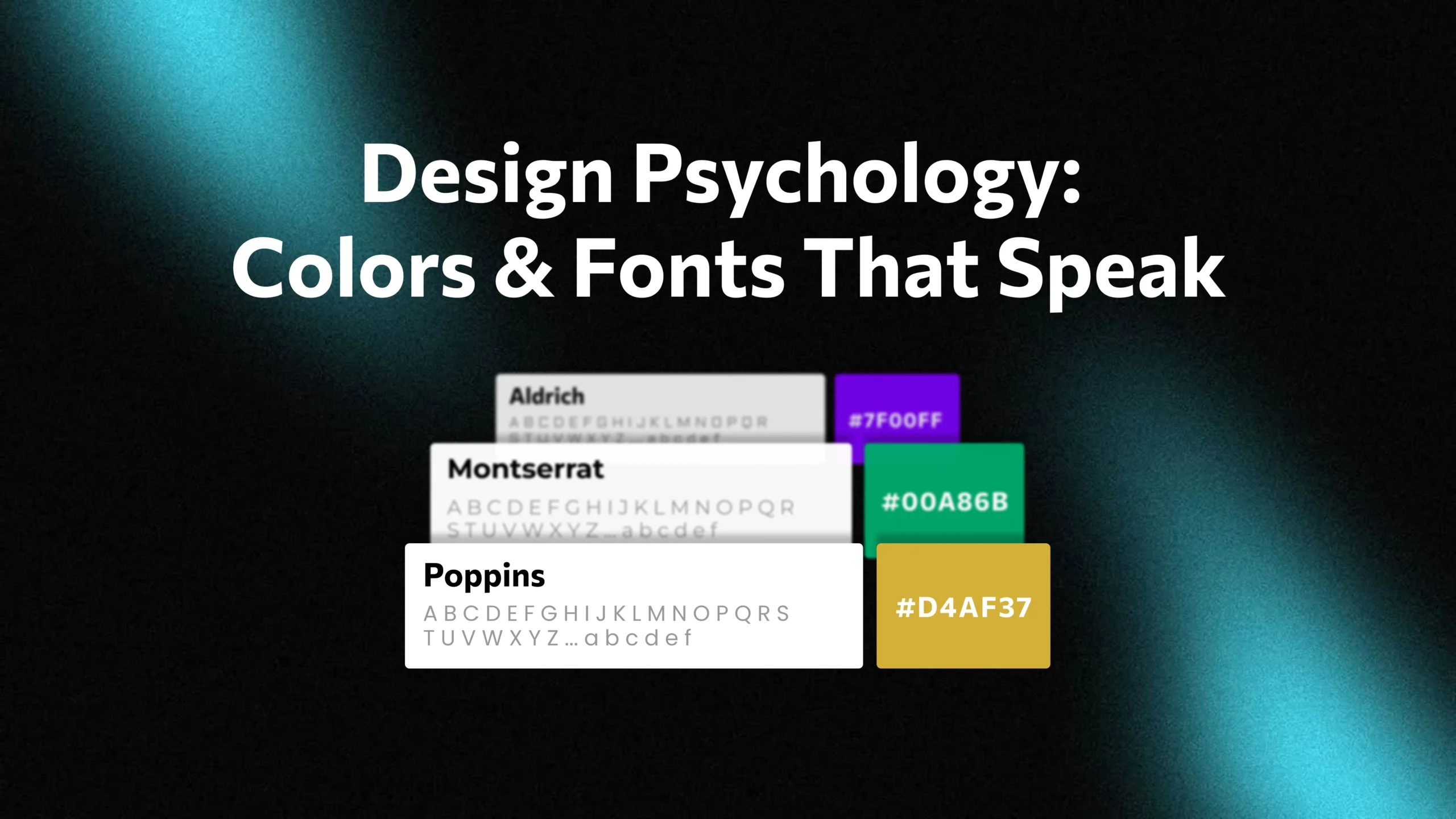
The Math of Color and Typography Combination
Color and typography don’t function in a silo; they are designed to complement each other to deliver a cohesive brand experience. So, picture your premium brand using neon pink fonts in Comic Sans: It would be at odds with the image you want to show.
Some proven pairings include:
- Luxury Brands → Black and gold theme with serifs.
- Tech startups → Blue, with a modern sans‐serif typeface.
- Creative agencies → Bold, bright colors in playful or custom typefaces.
- Wellness → Green with clean, pillowy sans-serifs.
When you match visual components in this way, it provides strong support for your brand personality and helps ensure your message is getting through to the right people.
The use of Color Psychology and Typography for your Business
At eLeoRex Technologies, we make it easy for customers to harness the power of these principles. Here’s what you can do:
Define Your Brand Personality
Before selecting colors and typefaces, define how you hope to be perceived. Are you going for trust and authority or creativity and fun?
Choose a Primary Color Palette
Choose one primary color and two to three secondary colors. Embed them in your site, marketing, and branding materials.
Test Typography Combinations
Select fonts that complement your personality and are easy to read. Brands usually set headlines in one typeface and body text in another.
Leverage Contrast for UX
To draw the eye, color and type size are used sparingly for CTAs (calls to action), primary messages, or points of navigation. Differences and similarities are what allow users to read the most meaningful.
Gather Real-User Feedback
What sounds right to you may not sound right or resonate with those you are communicating with. Ask real users in a usability test how they feel about your colors and fonts.
Common Mistakes to Avoid
Well-intentioned as they may be, companies sometimes commit design crimes that detract from how their users perceive them:
- Too many colors make images look busy and give a headache.
- Inconsistent font choices that look unprofessional and off-putting.
- Issues of accessibility, such as text with low contrast that’s difficult to read.
- Unthinkingly Following Trends, Not Brand Identity.
By taking a methodical, user-centered approach, your brand will be cohesive in appearance and feel across all its elements.
Why This is Important for Digital Marketing Success
In today’s business environment, first impressions are more important than ever. If your website or campaign feels instantly trustworthy, professional, and in line with what the user wants to see, then they’re more likely to convert.
Yes, color psychology and typography are small details, but they form the emotional backbone of your brand. They can cut through the digital noise and reinforce long-term customer loyalty.
Conclusion
Your brand is not just a logo, it’s the story that every color, font, and detail tells about your business. When it comes to learning the psychology of design, you can start building digital experiences that not only look beautiful but also earn trust, generate emotions, and achieve a call-to-action.
At eLeoRex Technologies, we have a penchant for integrating branding and user experience, empowering businesses to develop design systems that resonate directly with their audience. If you know how to use color and typography just right, you are not designing interfaces, but perceptions.
In the digital space, how users feel is often what drives them to return.